EDITORIAL
Threading and Narrating
-

Struct
BOOK
(Thesis Book) Struct, is a comprehensive exploration of how digital interfaces and the grids they form shape our perceptions and interactions with the world. Through a blend of theoretical inquiry, artistic practice, and design, the book redefines traditional boundaries between the digital and physical, offering insightful perspectives on modern visual culture and its impact on individual and communal experiences.
-

Domaine Display Type Specimen
TYPE SPECIMEN
It all begins with an idea. Maybe you want to launch a business. Maybe you want to turn a hobby into something more. Or maybe you have a creative project to share with the world. Whatever it is, the way you tell your story online can make all the difference.
-

The Agony of Eros
BOOK
Classical book design for one of my favorite book written by Byung-Chul Han. The book is originally written in German and internationally published in multiple languages. I found its English edition is very different from Korean edition, which provides a good atmospheric spaces to contemplate and imagine with humanistic touches. Hence, this project uses classical grid system and selection of single serif typeface, Domaine Display, to convey the reading experience I would like to introduce with the book of my recommendation.
-

@I.nn_visible
DIGITAL NATIVE
A visual essay on the history of camouflage pattern and surveillance capitalism. Through weaving researches it introduces the power of invisibility. Contextualized with hypervisibility from advent of social media, contents are designed native to Instagram.
-

MUNJADO
TYPEFACE
Digital typeface, Uppercase type | Inspired by Munjado (traditional Korean letter paintings) and based on Bifur, blending the West–East; modernist modularity–humanistic fluidity; computer–analog medium; while giving attention to what consists the letterforms in order to be recognized.
-
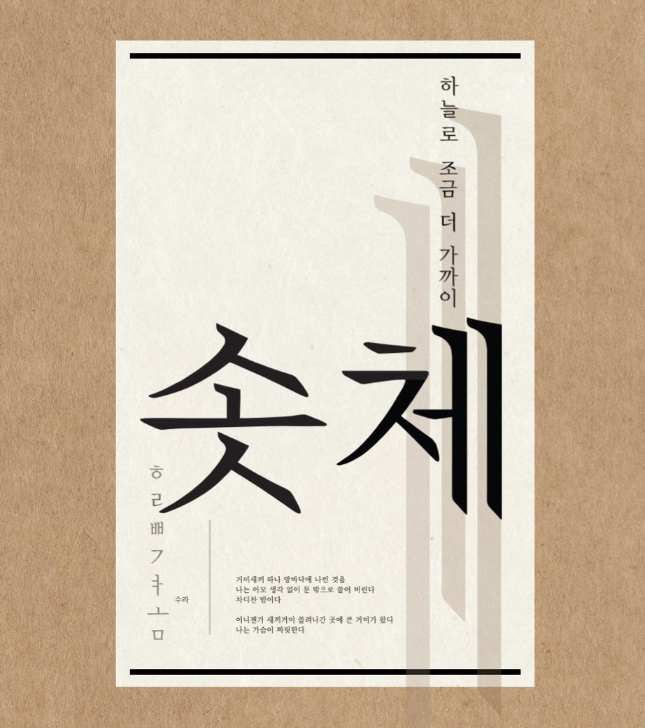
Sotchae
TYPEFACE
-

Mull Tree, Skin Peels
EPHEMERA
Design outcome from participating graduate practice conducted by Oltree Hui. (Methodology I: Epoché: Design for a Tree)
-

Macbeth
BOOK
A theater script that speaks itself. Through typography and layout design, the book redesigns Shakespeare's Macbeth into more reader-friendly theatrical experience. It marks when characters enter or leaves the scene, visualize form of conversation or a dialogue, and accentuate certain lines with key sentiments. Considering the spreads as a stage, the book is in large size with spacious breathing spaces.
-

Foundational
TYPEFACE
Digital typeface based of my handwritten letters in style of a historic calligraphy, Foundational.
-

Hush Hour
BOOK
A project dedicated to a personal love of a hot shower, which is my daily ritual, a meditation, and a source of inspiration.
By interweaving photography and book design, it aims to recreate the wash-through experience as if the reader is actually taking one. Photograph focuses on sensuous moments to capture details in a shower. Contents are ordered from the entrance to the exit. Writings are personal notes, conversations with friends, and interviews with strangers at coffee shops. In order to make it intimate, it was designed in pocket size with a hardcover. Tracing paper inserts visualizes the steam of a hot shower.
Photographed by myself for a month with a camera in a plastic bag, and a GoPro. A drawing from the high school year was inserted to cherish the consistent love for the hot shower. The drawing was printed on one of the tracing paper inserts.
Hardcover book, tracing paper inserts, 4.2 x 6 in, 90 pages
-

Hypercube
CALENDAR
A calendar design using hypercube to illustrate the concept of time. Hypercube is a mathematical concept that portrays 4-dimension in geometry. It’s composed of 8 interlocked cubes, yet looks like “a cube in a cube”. The idea is that time is 4D, and a calendar measures the time in the cycle of months, giving structures to which we frame the concept of time in a system. We believe in progress, completing, and restarting a year.
Hence, using a hypercube diagram as a grid, the calendar expands from a dot to the line, angle, side, and so on. But when it reaches December, lines connecting 12 dots form no structure but chaos, as we return to the beginning. Like the Big Bang started from one point and expanded to the universe, Graphics are composed of two textures: vector images and pencil textures. Each represents the two channels of how we experience time: digital and analog.
Adding another dimension to the calendar, the box is created as another analogy for the hypercube. As “box in a box” each symbolizes the two channels we experience time: digital and analog. The outer box represents digital screens with acrylic’s transparent surface. The inner box is created as a negative space from wood board pieces and represents analog. Using negative space brings physical space as part of the design.